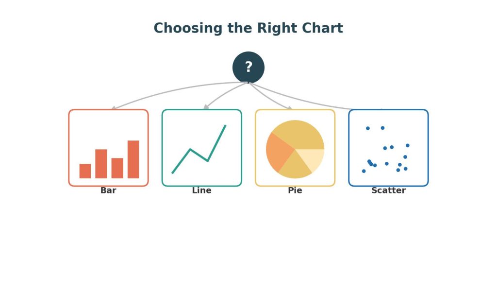
A brilliant analysis can fail completely if it’s communicated through the wrong chart. Data visualization is the bridge between statistical findings and human understanding — and choosing the wrong bridge (a 3D pie chart for time-series data, for instance) can actively mislead an audience rather than inform it. For students in a data analytics course, learning to match chart type to data type, and to follow evidence-based design principles, is just as important as the underlying statistical analysis.
This article covers how to choose the right chart for different data types, core design principles, and common visualization mistakes to avoid — with worked examples throughout.
Table of Contents
ToggleThe First Question: What Is the Data Type and What Are You Trying to Show?
The patterns you uncover during Exploratory Data Analysis (EDA): Techniques, Tools, and Worked Examples directly inform which chart to choose. Before selecting a chart, identify two things:
- Data type: Categorical, numeric (continuous or discrete), time-series, or geographic.
- Communication goal: Comparison, distribution, relationship, composition, or trend over time.
This two-part framework (popularized by data visualization expert Andrew Abela) is the fastest way to narrow down chart options.
Comparison — Comparing values across categories
Best charts: Bar charts, column charts
Worked example: A university wants to compare average student debt across five academic departments. A horizontal bar chart, sorted from highest to lowest debt, makes the comparison immediate — far more effective than a pie chart, which makes it difficult for the eye to compare slice sizes precisely, especially with five or more categories.
Distribution — Understanding the spread of a single variable
Best charts: Histograms, box plots, density plots
Worked example: To show the distribution of exam scores across 300 students, a histogram with 15–20 bins reveals whether scores are normally distributed, skewed, or bimodal (e.g., two humps suggesting two distinct performance groups) — information a single “average score” statistic would hide entirely.
Relationship — Showing how two or more variables relate
Best charts: Scatter plots, bubble charts, heatmaps
Worked example: To explore whether study hours relate to exam scores, a scatter plot with a trend line is far more informative than a bar chart, since it can reveal the shape of the relationship (linear, curved, or none) and any outliers (a student who studied 40 hours but scored poorly).
Composition — Showing parts of a whole
Best charts: Stacked bar charts, treemaps, (sparingly) pie charts
Worked example: To show the breakdown of a company’s revenue by product category over the last four quarters, a stacked bar chart is preferable to four separate pie charts, because it allows viewers to compare both the total revenue and each category’s share across time simultaneously.
Trend Over Time — Showing how a value changes
Best charts: Line charts, area charts
Worked example: To show monthly website traffic over two years, a line chart clearly reveals seasonality (e.g., traffic spikes every November) and long-term growth trends, which would be much harder to detect in a table of raw numbers.
Chart Selection Quick-Reference Table
| Goal | Data Type | Recommended Chart |
|---|---|---|
| Compare categories | Categorical | Bar chart |
| Show distribution | Numeric | Histogram, box plot |
| Show relationship | Two numeric variables | Scatter plot |
| Show composition | Categorical parts of a whole | Stacked bar, treemap |
| Show trend | Time-series | Line chart |
| Show geographic pattern | Location-based | Choropleth map |
| Compare many correlations at once | Numeric variables | Heatmap |
Core Design Principles
1. Maximize the Data-Ink Ratio
Statistician Edward Tufte’s principle of the “data-ink ratio” argues that every element on a chart should either represent data or aid its interpretation — anything else (heavy gridlines, 3D effects, unnecessary borders, decorative icons) is “chartjunk” that should be removed.
Example: A default Excel bar chart often includes a gray background, bold gridlines, and a legend even when there’s only one data series. Removing the background, lightening gridlines, and removing the redundant legend makes the actual data (the bars) more visually prominent.
2. Use Color With Purpose, Not Decoration
Color should encode meaning — highlighting a specific category, showing a gradient of magnitude, or distinguishing groups — not simply add visual variety.
Example: In a bar chart comparing sales across 10 regions, coloring every bar a different color adds visual noise without conveying information. A better approach: color all bars gray except the one region being highlighted (e.g., the region that missed its target), drawing the viewer’s eye directly to the key insight.
3. Start Bar Charts at Zero
Truncating the y-axis of a bar chart (starting at, say, 80 instead of 0) exaggerates differences between bars and is considered a serious violation of visualization ethics, even though it remains common in the media.
Example: If two products sold 98 units and 102 units respectively, a bar chart starting the y-axis at 90 would visually suggest Product B outsold Product A by a huge margin, when the actual difference is about 4%. Starting the axis at zero shows the bars as nearly identical in height — the honest representation.
(Note: this zero-baseline rule applies specifically to bar charts, where length encodes value. Line charts, which encode trend rather than absolute magnitude via bar length, can reasonably use a non-zero baseline when appropriate, such as to show fluctuation in a narrow range like stock prices.)
4. Order Categorical Data Meaningfully
Unless there’s a natural inherent order (like days of the week), categorical bars should typically be sorted by value (ascending or descending) rather than alphabetically, making comparisons and rankings immediately visible.
5. Label Directly When Possible
Instead of relying solely on a legend that requires the viewer’s eye to jump back and forth, labeling lines or bars directly (e.g., placing the category name at the end of a line in a line chart) reduces cognitive load.
Common Data Visualization Mistakes
- Using pie charts for more than 4–5 categories — the human eye struggles to compare angular slices precisely once there are too many.
- Using dual y-axes carelessly — combining two different scales on one chart (e.g., revenue in dollars and units sold) can create misleading visual correlations that don’t reflect the underlying relationship.
- 3D charts — 3D bar and pie charts distort the perceived size of data due to perspective, and should almost never be used for serious analysis.
- Overcrowded dashboards — presenting 15 charts on a single dashboard overwhelms the viewer; effective dashboards typically highlight 3–6 key metrics per view.
- Ignoring accessibility — using red-green color combinations that are indistinguishable to colorblind viewers (roughly 8% of men), or failing to add alt text for screen readers.
Worked Example: Redesigning a Poor Chart
Before: A student submits a 3D pie chart with 9 slices showing “reasons for customer churn,” each slice a different bright color, with a legend on the side.
Problems identified:
- Too many categories for a pie chart (9 slices are hard to compare)
- 3D effect distorts slice size perception
- Legend requires back-and-forth eye movement
After (redesign): A horizontal bar chart, sorted from most to least common churn reason, with bars colored gray except the top reason (highlighted in a contrasting color), and data labels showing exact percentages directly on each bar. This redesign lets a viewer identify the top churn driver within two seconds, rather than parsing a color-coded legend.
For students applying data visualization techniques in analytics coursework, this Data Analytics Assignment Help resource covers related areas such as data analysis, visualization, dashboards, and analytics projects.
FAQs
Q1: When is it acceptable to use a pie chart? Pie charts work best with very few categories (2–4) where the parts clearly sum to a meaningful whole (e.g., “yes/no” survey responses). Beyond that, a bar chart almost always communicates the comparison more clearly.
Q2: Why shouldn’t line chart y-axes always start at zero, if bar charts should? Bar charts encode value through bar length, so truncating the axis visually distorts the ratio between bars. Line charts encode value through position, and truncating the axis can be reasonable when the goal is to show fluctuation within a narrow, meaningful range (e.g., daily stock price movements), as long as the axis is clearly labeled to avoid misleading the viewer.
Q3: What’s the difference between a dashboard and a single chart? A single chart typically answers one specific question, while a dashboard is a curated collection of charts (often interactive) designed to give an ongoing, at-a-glance view of multiple key metrics, typically refreshed with live or regularly updated data.
Q4: Which tools are best for building data visualizations? For quick exploratory charts, Python (Matplotlib, Seaborn, Plotly) or R (ggplot2) are standard in academic settings, while Excel for Data Analytics: Advanced Functions, Pivot Tables, and Dashboards covers spreadsheet-based charting. For interactive business dashboards, Tableau and Power BI are the industry standards, offering drag-and-drop chart building without code — see our full comparison in Tableau vs Power BI: A Comparative Guide for Data Analytics Students.
Q5: How many charts should a dashboard include? There’s no fixed rule, but most visualization experts recommend limiting a single dashboard view to 3–6 key charts or metrics to avoid overwhelming the viewer — additional detail can be placed on secondary tabs or drill-down views.
Q6: What is “chartjunk”? A term coined by Edward Tufte referring to unnecessary visual elements in a chart — heavy gridlines, 3D effects, decorative icons, excessive borders — that don’t represent data and distract from the actual information being communicated.