
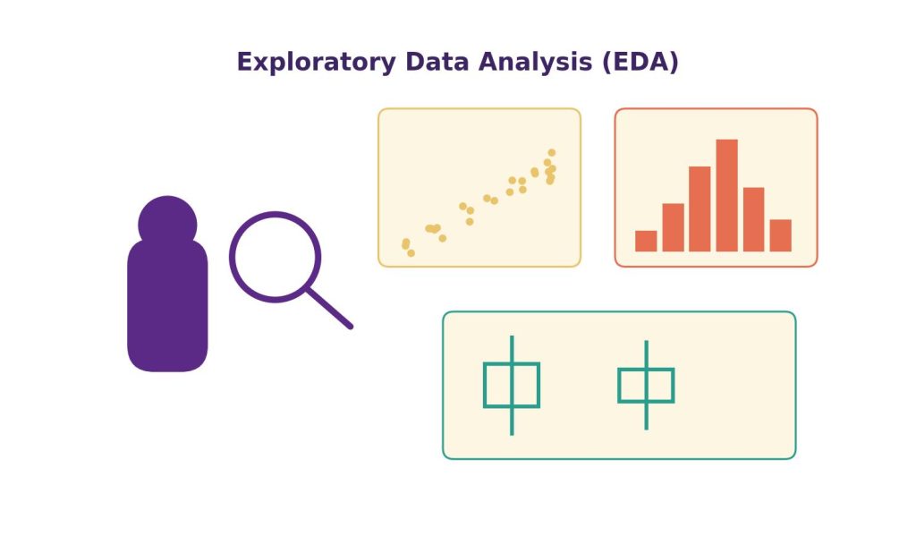
Before building a single predictive model or running a formal hypothesis test, every experienced data analyst does one thing first: they explore the data. Exploratory Data Analysis (EDA) is the process of investigating a dataset to summarize its main characteristics, uncover patterns, spot anomalies, and test assumptions — often using visual methods. Coined by statistician John Tukey in the 1970s, EDA remains one of the most important skills taught in any data analytics curriculum because it prevents analysts from applying the wrong technique to data that doesn’t meet its assumptions.
This article covers the core techniques of EDA — univariate, bivariate, and multivariate analysis — along with a complete worked example.
Table of Contents
ToggleWhat Is the Goal of EDA?
EDA is not about confirming a hypothesis (that’s the job of formal statistical inference); it’s about generating hypotheses and understanding data structure. These hypotheses are often tested formally afterward using techniques like Regression Analysis Explained with Worked Examples. Specific goals include:
- Understanding the distribution and range of each variable
- Detecting missing values, outliers, and data quality issues
- Identifying relationships between variables
- Checking assumptions required for later modeling (e.g., normality, linearity)
- Informing which variables and techniques are worth pursuing further
Univariate Analysis: Examining One Variable at a Time
Univariate analysis examines the distribution of a single variable, using both summary statistics and visualizations.
Key summary statistics:
- Central tendency: mean, median, mode
- Spread: range, variance, standard deviation (step-by-step calculation guide), interquartile range (IQR)
- Shape: skewness (asymmetry) and kurtosis (tailedness)
Common visualizations:
- Histograms — show the frequency distribution of a numeric variable
- Box plots — show median, quartiles, and outliers in a compact form
- Bar charts — show frequency counts for categorical variables
Worked example: An analyst examining a dataset of 5,000 customer orders for an online bookstore looks at the order_value column. The histogram shows a right-skewed distribution — most orders cluster between $15–$40, with a long tail extending to $300. The mean ($42) is noticeably higher than the median ($28), confirming the skew. This matters because it tells the analyst that a t-test assuming normality might be inappropriate for this variable without transformation, and that reporting “average order value” alone would be misleading — the median gives a more representative picture of a typical order.
import matplotlib.pyplot as plt

df["order_value"].hist(bins=40)
plt.title("Distribution of Order Value")
plt.xlabel("Order Value ($)")
plt.ylabel("Frequency")
plt.show()

print(df["order_value"].skew())  # Positive value confirms right skew
Bivariate Analysis: Examining Relationships Between Two Variables
Bivariate analysis explores how two variables relate to each other. The right technique depends on whether the variables are numeric or categorical.
- Numeric vs. numeric: Scatter plots and correlation coefficients (Pearson’s r for linear relationships, Spearman’s rho for monotonic non-linear relationships)
- Categorical vs. numeric: Box plots grouped by category, or bar charts of group means
- Categorical vs. categorical: Cross-tabulations (contingency tables) and stacked bar charts
Worked example: The bookstore analyst wants to know whether delivery_time relates to customer_rating. A scatter plot shows a clear negative trend, and calculating Pearson’s correlation coefficient gives r = −0.61, indicating a moderately strong negative linear relationship — longer delivery times are associated with lower ratings. Because this is EDA and not formal inference, the analyst notes this as a hypothesis worth testing formally (e.g., via regression) rather than a confirmed causal relationship.
correlation = df["delivery_time"].corr(df["customer_rating"])
print(f"Correlation: {correlation:.2f}")

plt.scatter(df["delivery_time"], df["customer_rating"], alpha=0.3)
plt.xlabel("Delivery Time (minutes)")
plt.ylabel("Customer Rating")
plt.show()
Multivariate Analysis: Examining Three or More Variables Together
Multivariate EDA looks for patterns across multiple variables simultaneously, which is often where the most actionable insights emerge.
Common techniques:
- Correlation heatmaps — visualize pairwise correlations across all numeric variables at once
- Pair plots — grid of scatter plots showing every pairwise relationship
- Grouped/faceted charts — break down a relationship by a third categorical variable
- Dimensionality reduction (PCA) — for datasets with many variables, reduces them to two or three components for visualization
Worked example: Extending the earlier finding, the analyst creates a correlation heatmap across delivery_time, customer_rating, order_value, and distance_from_store. The heatmap reveals that distance_from_store correlates strongly with delivery_time (r = 0.78) but has almost no direct correlation with customer_rating (r = 0.09) — suggesting that distance affects ratings indirectly, through delivery time, rather than directly. This distinction — an indirect vs. direct relationship — is a classic EDA insight that shapes what variables get included in a later predictive model.
import seaborn as sns

corr_matrix = df[["delivery_time", "customer_rating", "order_value", "distance_from_store"]].corr()
sns.heatmap(corr_matrix, annot=True, cmap="coolwarm")
plt.show()
EDA Checklist for Students
When approaching a new dataset for a course project, follow this sequence:
- Check the shape, data types, and first few rows (
df.head(),df.info()). - Compute summary statistics for all numeric columns (
df.describe()). - Visualize the distribution of each key variable (histograms, box plots).
- Check for missing values and outliers.
- Examine bivariate relationships relevant to your research question (scatter plots, correlation).
- Build a correlation heatmap to spot multivariate patterns.
- Note hypotheses generated during EDA to test formally in later analysis.
Students applying EDA techniques to course projects may also find this Data Analytics Assignment Help resource useful for related topics such as data analysis, visualization, Python, statistics, and analytics projects.
Common Mistakes in EDA
- Mistaking correlation for causation — EDA can only reveal association, never proves cause and effect.
- Ignoring the shape of the distribution — reporting only the mean when data is heavily skewed (as in the order value example) can mislead stakeholders.
- Overplotting — cramming too many variables into a single chart, making patterns harder to see rather than easier.
- Skipping EDA altogether — jumping straight to modeling without understanding the data risks building models on flawed assumptions (e.g., assuming linearity when the true relationship is curved).
FAQs
Q1: What is the difference between EDA and formal statistical analysis? EDA is exploratory and hypothesis-generating — it uses visualization and descriptive statistics to understand data and surface patterns. Formal statistical analysis (e.g., hypothesis testing, regression) is confirmatory — it tests specific, pre-defined hypotheses using inferential statistics.
Q2: Which comes first, EDA or data cleaning? They’re interleaved. A first pass of EDA (checking distributions, missing values) often reveals data quality issues that need cleaning (see Data Cleaning and Preprocessing: A Step-by-Step Guide for Analysts), after which further EDA is done on the cleaned dataset to explore relationships and patterns in depth.
Q3: What’s the best Python library for EDA? Pandas (for summary statistics and data manipulation), Matplotlib and Seaborn (for visualization), and increasingly, automated EDA libraries like pandas-profiling (now ydata-profiling) or Sweetviz, which generate a full exploratory report in a few lines of code.
Q4: How do I choose between Pearson and Spearman correlation? Use Pearson’s correlation when you expect a linear relationship between two numeric variables and the data is roughly normally distributed. Use Spearman’s rank correlation when the relationship is monotonic but not necessarily linear, or when the data contains outliers or is not normally distributed.
Q5: Can EDA alone answer a business question? Sometimes, for simple questions (e.g., “what is our average customer rating?”), EDA alone is sufficient. For more complex questions involving prediction or causal claims, EDA is a necessary first step but should be followed by formal statistical testing or modeling.