
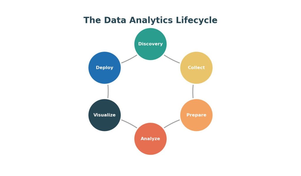
Behind every data-driven decision — a retailer changing its pricing strategy, a hospital adjusting staffing levels, a streaming platform recommending a new show — lies a structured lifecycle that transforms raw, messy data into a confident business decision. Understanding this lifecycle is one of the first things taught in any university-level data analytics program, because it provides the scaffolding for every technique students learn afterward.
This article walks through the data analytics lifecycle stage by stage, using a consistent worked example — a fictional food delivery company, “QuickBite” — to illustrate each phase concretely.
Table of Contents
ToggleWhy a Structured Lifecycle Matters
Novice analysts often jump straight into building charts or running statistical tests without first clarifying the question or checking data quality. This leads to a common failure mode: technically correct analysis that answers the wrong question, or analysis built on flawed data that produces misleading conclusions. A structured lifecycle — closely related to the industry-standard CRISP-DM (Cross-Industry Standard Process for Data Mining) framework — prevents this by enforcing discipline at each stage.
Stage 1: Discovery and Problem Framing
Every analytics project begins by defining the business problem in measurable terms. This means translating a vague goal into a specific, testable question.
Example: QuickBite’s leadership says, “Our customer retention feels weak.” An analyst reframes this as: “What percentage of first-time customers place a second order within 30 days, and which factors (delivery time, order value, restaurant category) most strongly predict repeat orders?”
At this stage, analysts also identify:
- Stakeholders (who will use the findings)
- Success metrics (what does “solved” look like?)
- Constraints (budget, timeline, data access, privacy regulations)
Stage 2: Data Collection
Once the question is defined, analysts identify and gather relevant data sources. Data can come from:
- Internal databases (SQL tables of orders, customers, deliveries)
- APIs (weather data, third-party review scores)
- Surveys (customer satisfaction responses)
- Web/app logs (clickstream data, session duration)
- Public datasets (census data, economic indicators)
Example: For QuickBite’s retention question, the analyst pulls order history from the transactional database, customer support tickets, and app session logs from the past 12 months — roughly 2.3 million order records.
A key consideration here is data governance: ensuring the data collected complies with privacy laws (e.g., GDPR, CCPA) and that personally identifiable information is handled appropriately.
Stage 3: Data Preparation (Cleaning)
This is consistently the most time-intensive stage of the lifecycle, often consuming 60–80% of total project time (for a full walkthrough, see Data Cleaning and Preprocessing: A Step-by-Step Guide for Analysts). Data preparation includes:
- Handling missing values (e.g., missing delivery timestamps for 4% of orders)
- Removing duplicates (e.g., orders logged twice due to a system glitch)
- Standardizing formats (e.g., converting all timestamps to a single timezone)
- Outlier detection (e.g., an order marked as taking 14 hours to deliver, likely a data entry error)
- Feature engineering (e.g., creating a new “days since last order” column from raw timestamps)
Example: The analyst discovers that 6% of orders are missing a “delivery time” field due to a logging bug during a specific two-week period. After investigating, they decide to exclude that window from time-sensitive analysis rather than impute the values, since the missingness is not random (it’s tied to a known system issue).
Stage 4: Exploratory Analysis and Modeling
With clean data in hand, analysts explore patterns and, where appropriate, build statistical or machine learning models. This exploratory step is covered in depth in Exploratory Data Analysis (EDA): Techniques, Tools, and Worked Examples.For students working on analytics projects, assignments, or coursework, data analytics assignment help can also provide support with data analysis, statistical methods, Python, Excel, and related coursework.
Example: Exploratory analysis reveals that customers whose first delivery took longer than 45 minutes are 2.3 times less likely to place a second order. The analyst then builds a logistic regression model incorporating delivery time, order value, restaurant rating, and promotional discount status to predict the probability of a repeat order. The model shows delivery time is the single strongest predictor, followed by whether a discount was applied to the first order.
This stage may involve:
- Descriptive statistics and visualization (histograms, scatter plots)
- Hypothesis testing (e.g., t-tests comparing retention between customer segments)
- Predictive modeling (regression, classification, clustering)
- Model validation (train/test splits, cross-validation, checking for overfitting)
Stage 5: Visualization and Communication
Findings must be translated into a form decision-makers can act on. For guidance on choosing the right chart type, see Data Visualization Best Practices: Choosing the Right Chart for Your Data. This typically means building dashboards, charts, or a narrative report — not just presenting raw statistical output.
Example: The analyst builds a Tableau dashboard showing repeat-order rate by delivery-time bucket, alongside a projected revenue impact if delivery times over 45 minutes were reduced by 15%. The headline finding is stated in plain language: “Cutting late deliveries by 15% could increase 30-day retention by an estimated 8 percentage points, worth approximately $420,000 in annual repeat-order revenue.”
Effective communication at this stage follows a few best practices:
- Lead with the recommendation, not the methodology.
- Use one clear chart per key insight rather than dense multi-panel dashboards.
- Quantify business impact in dollars, percentages, or another metric stakeholders care about.
Stage 6: Deployment and Monitoring
The final stage — often overlooked in academic settings but critical in industry — involves implementing the recommendation and monitoring outcomes over time.
Example: QuickBite’s operations team reallocates delivery drivers during peak hours to reduce average delivery time. The analytics team sets up a monitoring dashboard that tracks weekly delivery time and 30-day retention rate, allowing them to verify whether the intervention produces the predicted 8-point retention lift, and to catch any unintended side effects (e.g., increased driver costs).
This stage closes the loop of the lifecycle — the results of the deployed decision become new data that feeds back into Stage 1 of the next analytics cycle.
The Data Analytics Lifecycle vs. CRISP-DM
Students often encounter the six-stage lifecycle above alongside the classical CRISP-DM model, which has six similar phases: Business Understanding, Data Understanding, Data Preparation, Modeling, Evaluation, and Deployment. The two frameworks map closely onto each other; CRISP-DM places slightly more emphasis on formal model evaluation, which is especially relevant in data science and machine learning coursework.
Common Mistakes Students Make in the Lifecycle
- Skipping problem framing and diving straight into the dataset, leading to analysis that doesn’t answer a real question.
- Under-investing in data cleaning, producing results that look sophisticated but rest on flawed data.
- Overfitting models to the training data without validating on unseen data.
- Presenting technical output (raw regression tables, p-values) to non-technical stakeholders instead of translating findings into business language.
- Never closing the loop — failing to measure whether the recommended action actually worked.
FAQs
Q1: How long does each stage of the data analytics lifecycle typically take? It varies by project, but data preparation is consistently the longest stage, often taking 60–80% of total project time. Problem framing might take a few days for a small project, while data cleaning for a large dataset can take weeks.
Q2: Is the data analytics lifecycle the same as CRISP-DM? They are closely related but not identical. CRISP-DM is a more formal, widely cited six-phase framework originally developed for data mining, while “the data analytics lifecycle” is a more general term that different textbooks and courses define with slightly different stage names, though the overall flow is nearly identical.
Q3: Why is data cleaning so time-consuming? Real-world data is rarely collected with analysis in mind — it comes from operational systems designed for transactions, not research. This means missing values, inconsistent formats, duplicate records, and human entry errors are common, and each must be identified and handled carefully to avoid skewing results.
Q4: What happens if you skip the deployment/monitoring stage? Without monitoring, organizations cannot verify whether a data-driven recommendation actually achieved its intended effect, which risks repeating ineffective decisions and undermines trust in future analytics work.
Q5: Can the lifecycle be non-linear? Yes. In practice, analysts frequently loop back — for example, discovering during modeling that additional data is needed, sending them back to the data collection stage. The lifecycle is best understood as iterative rather than strictly linear.